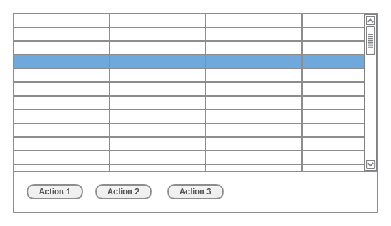
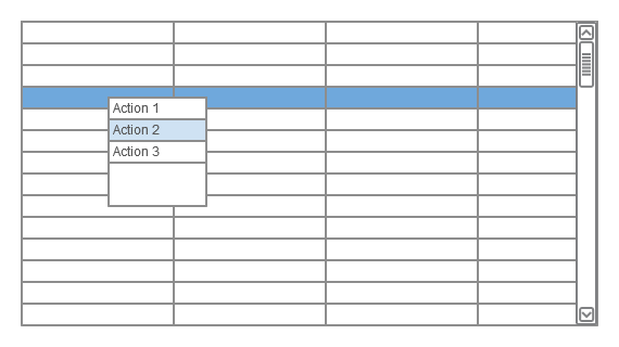
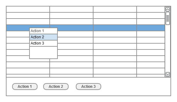
Recently I was drawn into one of those UI “religious” disputes that has no easy answers and usually both sides are right. One of our web developers was trying out new web tech (with pretty rich widget library) and started to question himself about some basic usability decisions. The low level problem in this case is usually brought to “which widget should I use ?”. I’m not fond of bringing the usability problems to questions: Should I use Tabs over Menu ? Or should I use Context menu instead of buttons panel ? But sometimes if time is crucial factor and other usability levels are by default not addressed at all – better developer that asks those basic questions than developer that do not question himself at all. One of often “problematic” choice that is bring up by web developers is should user launch actions on selected objects (one of many or some of many) by “Context menu” or “Action buttons”. Basic example is shown below and it is usually a table or list of components that has some defined actions (i.e. on table where rows are single orders change status of selected order would be on of possible actions). Of course there are many other solutions that can be implemented (some actions can be handled directly in table row or cell) but narrowing choice to those two was subject of mentioned discussion. During those hot and fast discussions I wasn’t able to point out pros and cons of both solution that’s why I decided to grab them all in this one short post. I hope it will be helpful for same lone developers that thirstily look for best practise or choice while the answer is usually much contextual…
 Pros
Pros
- Clear indication of where and how many actions you can apply to selected row (or other selected object)
- If action panel is visible all the time theme has expectable behaviour (at least if you are consistent at where you position your action panel)
- Accessible solution on most mediums (mouse, touch screens, other pointing devices), panel can be bookmarked to be heard on reading devices
- Action panel can be combined with Details panel (if there is enough space)
- Actions can be described very precisely
 Cons
Cons
- Space consumption, even if some actions can be hidden under “Advanced” button, this design is always more “stuffed”
- Can generate (sometimes really long) extra mouse moves and additional clicks
- Keyboard support may be difficult if rows or selected widgets also use navigations buttons (tab key, arrows etc.)
Context menu
{#Test-Contextmenu}
 Pros
Pros
- If you stick to short action names space consumption is minimal and since it’s used only during action selection it’s also less perceptible
- Much faster if you use mouse or keyboard (with context menu shortcut / button)
- Actions can be organised in tree like hierarchy which can be navigated (expanded) with minimal mouse moves and no additional mouse clicks
- Nicely combines with drag&drop or multi record actions
 Cons
Cons
- Since context menu is invisible until explicitly called some people may not be aware that there are any actions available on selected objects
- Poor support on some touch pads or touch screens, problematic support on screen readers
- If used in web applications it overrides default browser context menu which can be a nuisance for some users
Why not both ?
{#Test-Whynotboth%3F}
 Pros
Pros
- Beginners has clear indication of where and what actions are available on selected objects
- Advanced users can use faster context menu approach, that do not confuse beginners (they still has their action buttons)
- Action buttons panel can be compressed to minimum, only to show most important actions (other actions can be hidden under “Advanced” button)
- Action panel can be combined with Details panel, since action buttons would be minimal, there should be more space for details
- Hide action panel option if workspace size is crucial (i.e. some clients has limited screen size) and users are aware of context menu
 Cons
Cons
- Initially you still loose some fix space
- Redundancy may be confusing for some users (although this con is questionable – unaware beginners do not see any redundancy, advanced users can hide action panel if it REALLY bothers them)


